In machine learning and educational research, choosing the right metric to evaluate a classifier’s performance is critical. While many people are familiar with accuracy, there are other diagnostic metrics that provide deeper insights into how well a model is performing. In this blog, we’ll dive into two metrics: Accuracy and Cohen’s Kappa, explaining why accuracy may not always be the best choice and how Kappa offers a more robust measure of agreement.
1. Accuracy: The Well-Known but Flawed Metric
Accuracy is one of the oldest and most widely used metrics for evaluating classifiers. It is easy to compute and straightforward to interpret, making it a popular choice, especially in earlier research and simpler classification tasks. Accuracy is simply the ratio of correct predictions (true positives and true negatives) to the total number of predictions.
Formula:
[math]\text{Accuracy} = \frac{\text{Number of correct predictions}}{\text{Total number of predictions}}[/math]
Accuracy is also referred to as “agreement” when measuring inter-rater reliability (IRR). In that context, the formula for IRR looks like this:
[math]\text{IRR} = \frac{\text{Number of agreements}}{\text{Total number of codes or assessments}}[/math]
Despite its popularity, there is broad consensus across various fields that accuracy is not always a reliable metric, especially in imbalanced datasets. Let’s explore why.
Why is Accuracy Not Always a Good Metric?
Accuracy can be misleading in certain scenarios, particularly when:
- Imbalanced Data: If one class is much more frequent than another, the model can appear to perform well by simply predicting the majority class most of the time. For instance, if 95% of students in a course pass, a model that predicts “pass” for every student would have an accuracy of 95%, despite being useless at identifying the failing students.
Un-Even Assignment to Categories: In real-world classification tasks, labels are rarely evenly distributed, leading to a skewed performance evaluation when using accuracy. To make this clearer, consider a university course where we are predicting if students will be on-task or off-task during an online learning activity. If 80% of students are on-task and only 20% are off-task, a model that always predicts on-task would achieve high accuracy, even though it’s not good at detecting off-task behavior.
2. Cohen’s Kappa: A Better Alternative
To address some of the limitations of accuracy, we can use Cohen’s Kappa, a more sophisticated metric that accounts for the possibility of agreement occurring by chance. Unlike accuracy, Kappa adjusts for the likelihood that some agreement between the model’s predictions and actual labels happens purely by coincidence.
Formula:
[math]\text{Kappa} = \frac{\text{Observed Agreement} – \text{Expected Agreement}}{1 – \text{Expected Agreement}}[/math]
Kappa measures the agreement between two raters (or a model and ground truth) after correcting for chance. It ranges usually from -1 (perfect disagreement) to 1 (perfect agreement).
Example: Calculating Kappa for On-Task Behaviour
Let’s walk through a concrete example. Suppose we are using a model (or detector) to identify whether students are on-task or off-task during an online activity. The actual data and model predictions are arranged as follows:
| Detector Off-Task | Detector On-Task | |
|---|---|---|
| Data Off-Task | 20 | 5 |
| Data On-Task | 15 | 60 |
Here’s how we can calculate Kappa step by step:
- Observed Agreement:
The total number of correct predictions (agreements) is 20 + 60 = 80. Since there are 100 total instances, the percentage agreement is:[math]\text{Percentage Agreement} = \frac{80}{100} = 80\%[/math] - Expected Agreement:
To compute expected agreement, we first calculate the marginal proportions for both the data and the detector. These are the probabilities that the data or detector predicts “on-task” or “off-task”:- Data’s expected frequency for on-task: [math]\frac{15 + 60}{100} = 75\%[/math]
- Detector’s expected frequency for on-task: [math]\frac{5 + 60}{100} = 65\%[/math]
The expected agreement for on-task predictions is:
[math]0.275\times 0.365= 0.4875 = 48.75\%[/math]
For off-task predictions, we get:
- Data’s expected frequency for off-task: [math]\frac{20 + 5}{100} = 25\%[/math]
- Detector’s expected frequency for off-task: [math]\frac{20 + 15}{100} = 35\%[/math]
The expected off-task agreement is:
[math]0.25 \times 0.35 = 0.0875 = 8.75\%[/math]
Therefore, the total expected agreement is:
[math]48.75\% + 8.75\% = 57.5\%[/math]
- Calculating Kappa:
Now we can compute Kappa: [math]\text{Kappa} = \frac{0.80 – 0.575}{1 – 0.575} = \frac{0.225}{0.425} \approx 0.529 = 52.9\%[/math]
This means that our model is 52.9% of the way to perfect agreement.
Interpreting Kappa
The interpretation of Kappa values follows these guidelines:
- Kappa = 1: Perfect agreement between model and data.
- Kappa = 0: Agreement is purely by chance.
- Kappa = -1: Perfect disagreement (model predictions are the inverse of the data).
- The range between 0 and 1 for Kappa can be explained as follows:
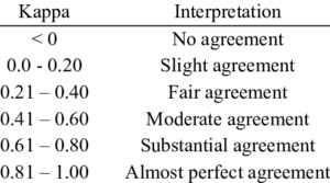
In the above example, a Kappa of 0.529 indicates moderate agreement, significantly better than chance but far from perfect.
3. Why Kappa is Better than Accuracy
Accuracy tends to bias in favor of the majority class in imbalanced datasets, which can lead to an overestimation of a model’s performance. For example, in a university setting where most students are predicted to pass, accuracy may give a high score even if the model struggles with identifying students who are likely to fail.
Kappa, however, accounts for the base rates of each class, meaning it adjusts for class imbalances. This makes Kappa a more reliable metric when evaluating classifiers, especially in educational contexts where class distributions are often skewed (e.g., pass/fail or on-task/off-task).
Accuracy vs. Kappa
There is no universal threshold for Kappa because its value depends on the proportion of each category in the dataset. When one class is significantly more prevalent, the expected agreement becomes much higher than it would be if the classes were evenly distributed.
While accuracy tends to favor imbalanced data by inflating performance for the majority class, Kappa works against this bias. However, Kappa’s bias is far weaker, making it a more balanced and reliable metric for evaluating models, especially in scenarios where class imbalance is a concern.
Receiver Operating Characteristic (ROC) Curve
In binary classification tasks, where the objective is to predict outcomes with two possible values (e.g., Correct/Incorrect, Pass/Fail, or Dropout/Not Dropout), it is crucial to assess how well a model performs. Often, instead of simply classifying an outcome as “yes” or “no,” the model provides a probability (e.g., predicting that a student will drop out with a 75% probability). To evaluate the quality of such a model, we use the Receiver Operating Characteristic (ROC) Curve.
The ROC curve is generated by adjusting the classification threshold across a range of values. As we modify this threshold, the data points predicted as positive or negative shift, leading to different trade-offs between True Positives and False Positives.
Four Possible Outcomes of Classification
When evaluating the model’s performance at any threshold, four possible outcomes exist:
- True Positive (TP): The model correctly predicts a positive outcome (e.g., a student who will actually drop out is predicted to drop out).
- False Positive (FP): The model incorrectly predicts a positive outcome (e.g., a student who will not drop out is predicted to drop out).
- True Negative (TN): The model correctly predicts a negative outcome (e.g., a student who will not drop out is predicted as not dropping out).
- False Negative (FN): The model incorrectly predicts a negative outcome (e.g., a student who will drop out is predicted as not dropping out).
ROC Curve: Graphing Model Performance
The ROC curve plots two critical relationships as the classification threshold changes:
- X-axis: False Positive Rate (FPR), which represents the proportion of incorrect positive predictions (FP) relative to the true negatives (TN).
- Y-axis: True Positive Rate (TPR), also known as Recall, which represents the proportion of correctly predicted positive outcomes (TP) relative to the actual positives (FN).
As the False Positive Rate increases (moving right on the x-axis), the True Positive Rate also increases (moving up on the y-axis), giving us the ROC curve.
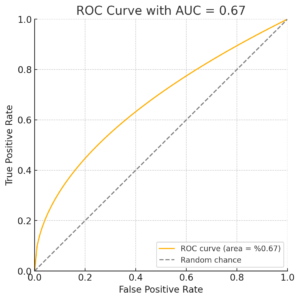
For comparison, a dashed diagonal line can be drawn where the False Positive Rate equals the True Positive Rate. This line represents random guessing, and any model that performs better than chance will have an ROC curve above this line.
Area Under the Curve (AUC)
One important measure derived from the ROC curve is the Area Under the Curve (AUC). This value represents the probability that the model will correctly differentiate between two categories (e.g., dropout and not dropout). Mathematically, this is equivalent to the Wilcoxon statistic (Hanley & McNeil, 1982), which assesses the probability that the model will correctly rank a positive instance higher than a negative one.
The AUC can also be used to perform statistical tests:
- Comparing Two AUCs: You can assess whether two AUC values (from different models or datasets) are statistically different.
- Comparing an AUC to Random Chance: A test can determine whether an AUC is significantly different from a value of 0.5 (random guessing).
Several statistical tests, such as those proposed by Hanley & McNeil (1982) for large datasets, and DeLong et al. (1988) for datasets of any size, are commonly used to evaluate the significance of AUC values.
However, these tests have limitations. They assume:
- Independence among students, which may not be valid in educational settings (Baker et al., 2008).
- No interrelationships between models, an assumption that can be problematic when comparing models with overlapping features (Demler et al., 2012).
Finally, it’s important to note that AUC is designed for binary classification. Computing AUC for models with more than two categories is complex and not always supported by existing tools.
AUC vs. Kappa: Key Differences
- AUC is more challenging to compute and is only suitable for binary classification without advanced extensions.
- AUC is invariant across datasets (e.g., AUC = 0.6 is always better than AUC = 0.55, regardless of the data).
- AUC values tend to be higher than Kappa values because AUC accounts for confidence levels, whereas Kappa does not.
Precision and Recall
Precision and Recall are two key metrics used to evaluate the performance of classification models:
- Precision is the proportion of true positive predictions among all instances predicted as positive by the model. [math]\text{Precision} = \frac{TP}{TP + FP}[/math]
- Recall, or True Positive Rate, is the proportion of actual positive instances that the model correctly predicts. [math]\text{Recall} = \frac{TP}{TP + FN}[/math]
Precision-Recall Curves
The Precision-Recall (PR) curve shows the trade-off between precision and recall for different decision thresholds. This is often more informative than looking at a single precision and recall value provided by machine learning packages, as the PR curve visualises how performance changes across thresholds.
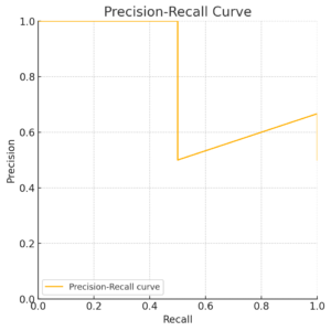
Precision-Recall curve showing the trade-off between precision and recall across different thresholds.
F1 Score
The F1 Score is the harmonic mean of precision and recall. It’s a balanced metric that is useful when both precision and recall are important for evaluation:
[math]F1 Score = \frac{2 \times \text{Precision} \times \text{Recall}}{\text{Precision} + \text{Recall}}
[/math]
Some prefer the F1 Score as an alternative to Kappa, especially when evaluating imbalanced datasets.
Other Statistical Terminology
- False Positive (FP): This is equivalent to a Type 1 error, where a false alarm is raised (e.g., predicting a student will fail when they won’t).
- False Negative (FN): This is equivalent to a Type 2 error, where a model misses a true positive (e.g., failing to predict a student’s dropout when they will actually drop out).
Reference:
Baker, R.S. (2024) Big Data and Education. 8th Edition. Philadelphia, PA: Universiwty of Pennsylvania.


